Customising the Roadie UI
Published on October 22nd, 2021Introduction
Roadie allows you to configure which plugins you want to use via our UI. This guide explains the different types of plugin components and the different places they can be integrated into the app.
Prerequisites
You must be an admin to edit the UI layout. Please complete this guide before moving on to this one.
The Roadie UI
The Roadie UI is made up a few different elements:
- A global Theme which controls styling across the application
- Catalog layouts, which are made up of Entity Pages, Tabs, and Plugin cards.
- Sidebar items, which allow easy navigation for a subset of pages.
- A Home Page (optional), which provides a single pane of glass for users when they log in.
How is the Roadie UI built?
Backstage is a plugin based application where each plugin provides a certain piece of functionality. A plugin may integrate with some external system such as GitHub to display information for a certain Entity e.g. Show pull request information for a particular service.
Backstage plugins can provide three different types of UI elements:
- Card - These are tiles which can be arranged into dashboards in the software catalog. E.g. The About card.
- Content - These are tabs which can be integrated with the catalog. E.g. The TechDocs tab.
- Page - These are top-level pages in Backstage, outside of the catalog. Accessible via links in the sidebar. E.g. The catalog itself is a Page.
You can read more about Backstage plugins here.
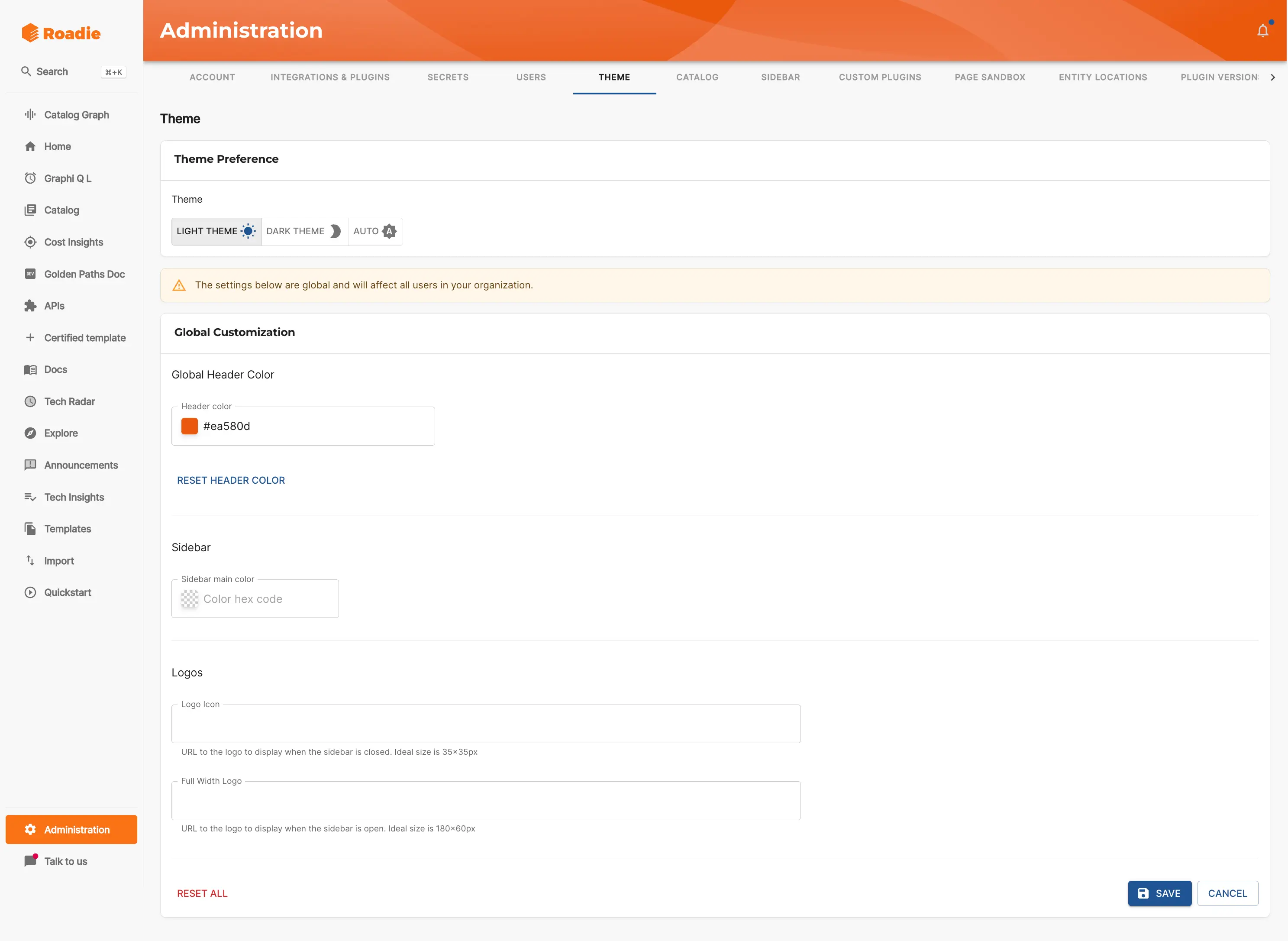
Updating the Theme
The Roadie theme can be customized to fit your organizational brand.
In the Theme tab of the Admin area you can set theme variables like:
- Global header colour
- Sidebar colours
- Logos for both the full width sidebar and minimized sidebar
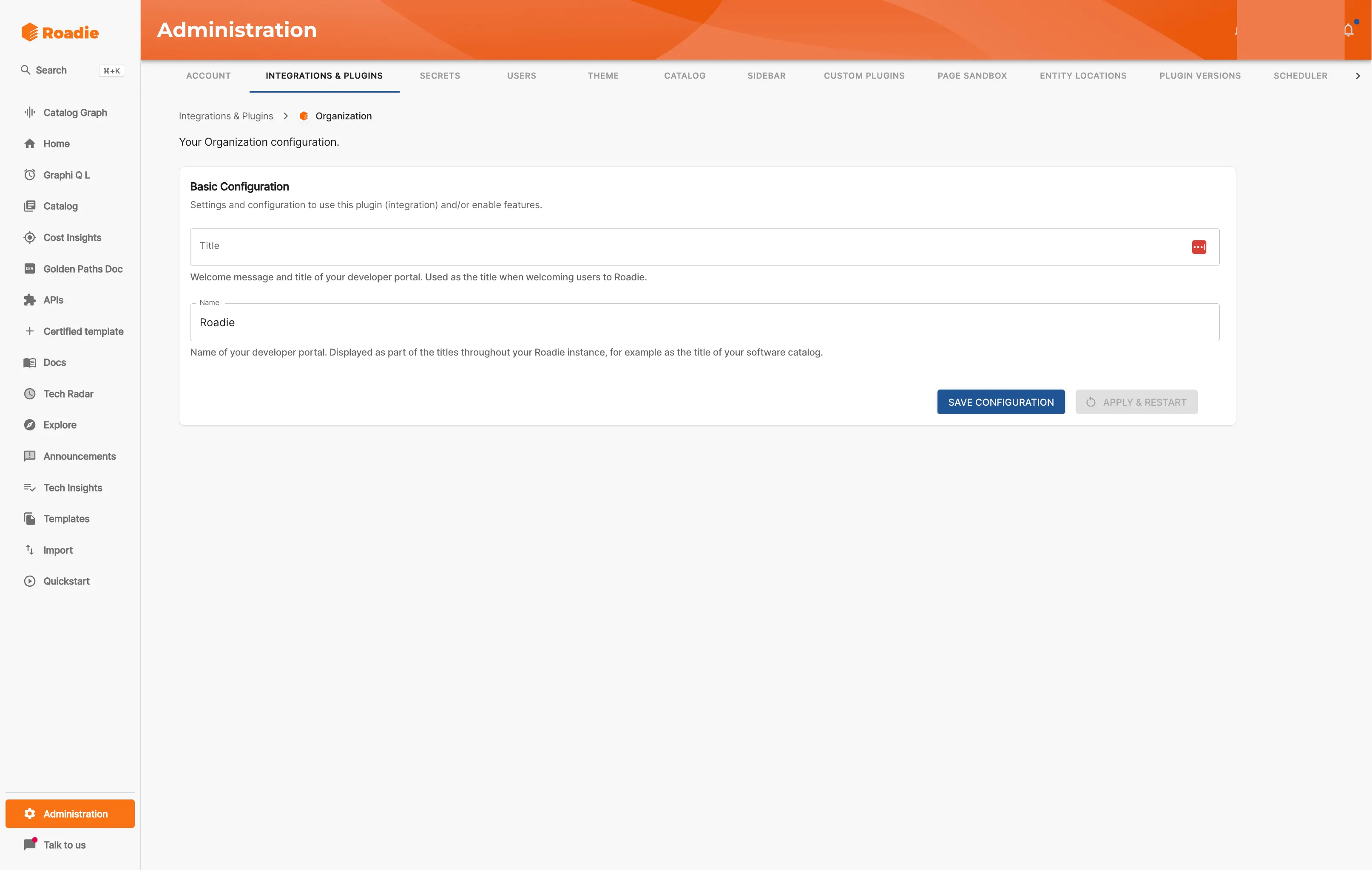
In addition you can set a global title and welcome message for your Roadie instance in the Integrations & Plugins > Organization area of the Admin section.
Updating the Catalog Layout
Admin users can add components to catalog pages to configure what is displayed to users when they view an entity.
Layouts are configured per entity kind except for Component entities which have layouts per type. For example, "User" and "Group" are each kinds of entity and so User entities have a different layout to Group entities. Similarly, Component entities have types such as "Service", "Library", "Website", etc and different types can have different layouts. However, a particular entity can't have its own layout; A particular Group or service can't have a unique layout. This is to encourage a consistent UX.
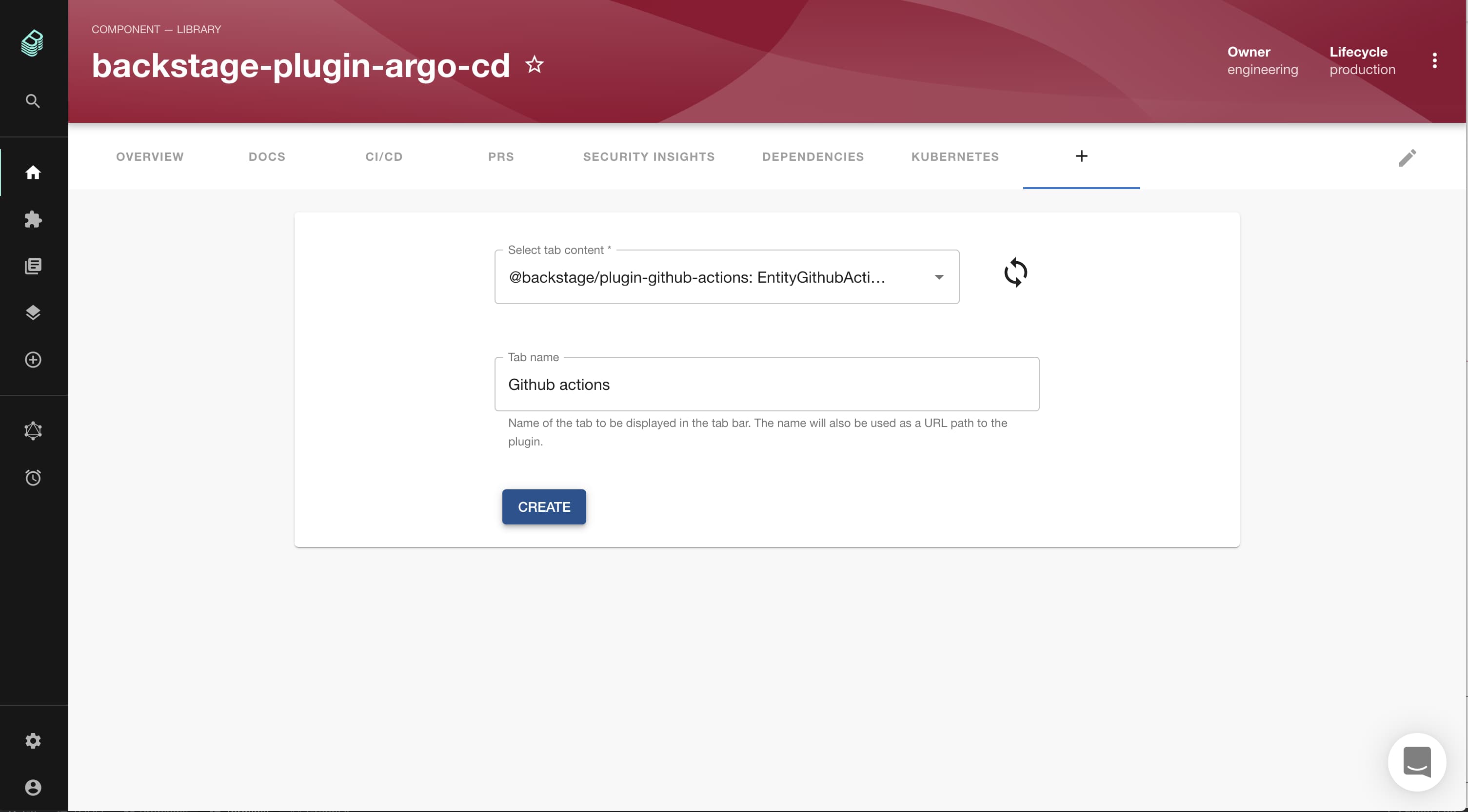
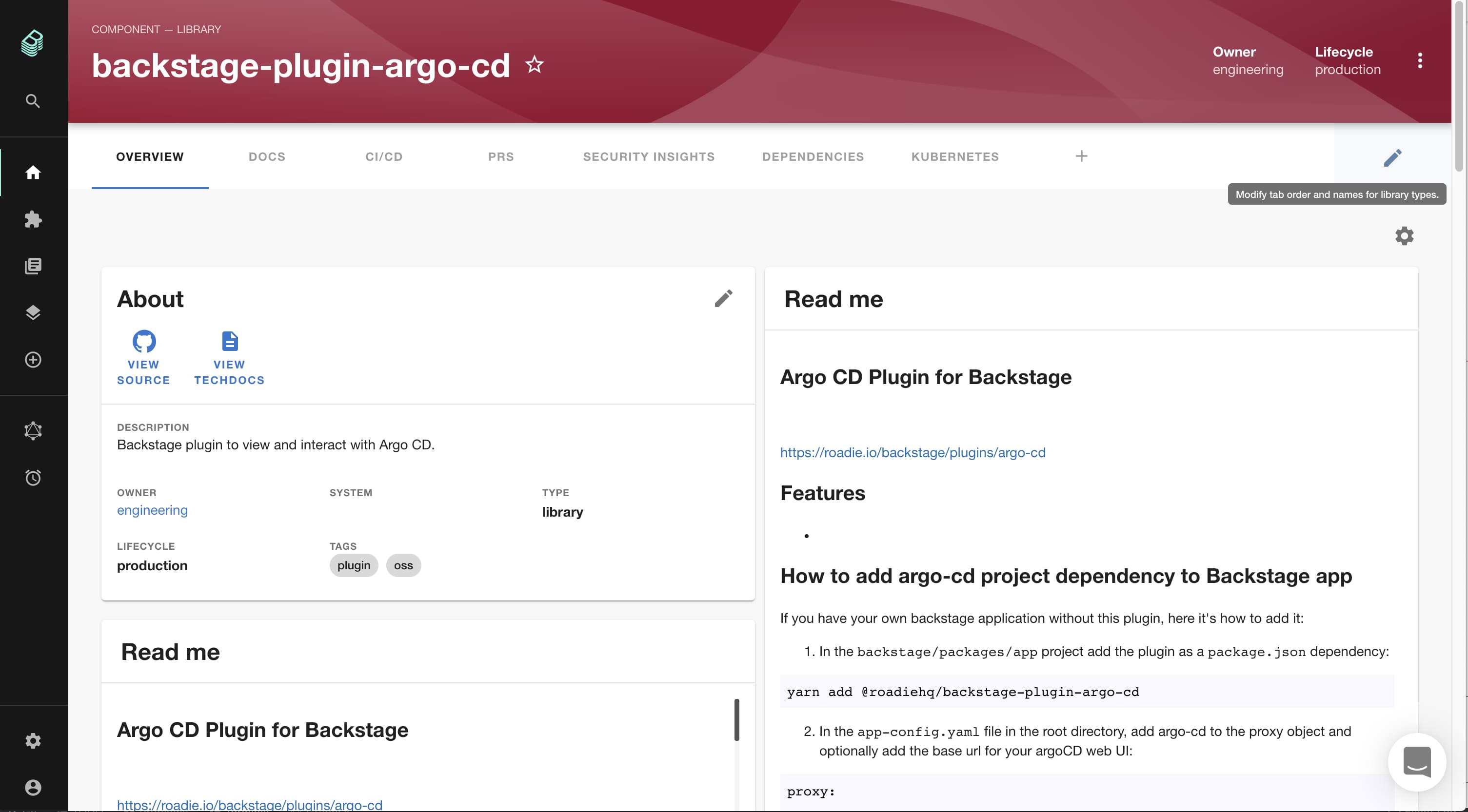
Updating Tabs
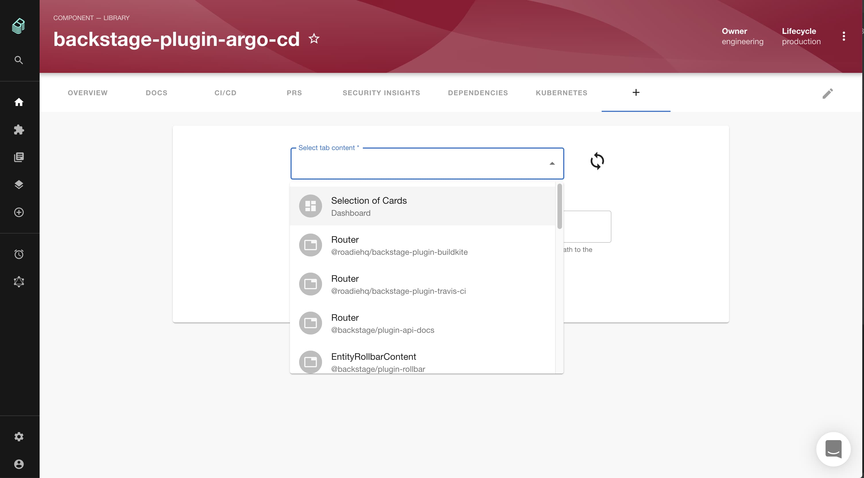
To add a tab click the plus icon at the end of the tab list.
Then select the component to add via the autocomplete and give the tab a display name and click "Create".
NB: When choosing a name please make sure it starts with something unique. (There is currently a
bug in opensource backstage which means that if you create a new
component that shares the same initial name as an existing one (i.e. Api and Api Visualiser), you will not be able
to select the new component.)
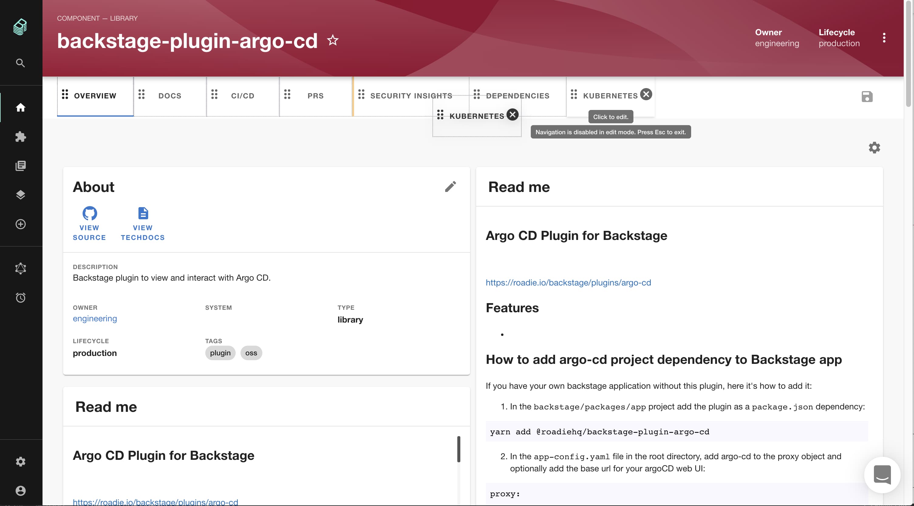
To rearrange or delete tabs select the "pencil" edit icon on the far right of the tab bar.
Then drag and drop to rearrange or click the "x" icon to remove a tab then click the save icon on the right hand side.
Updating Dashboards
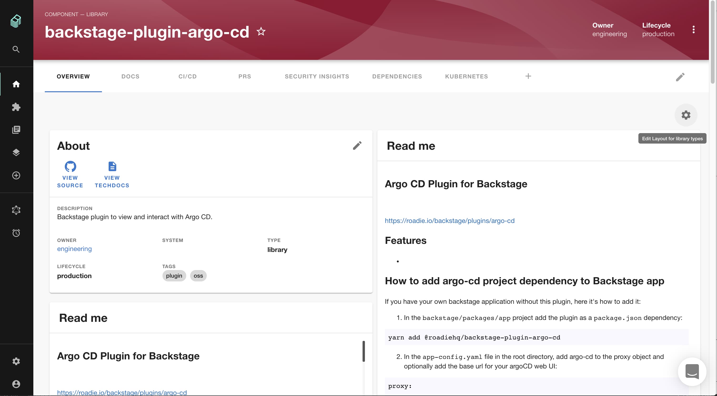
To edit a dashboard click the cog icon on the top right of the dashboard below the tab bar.
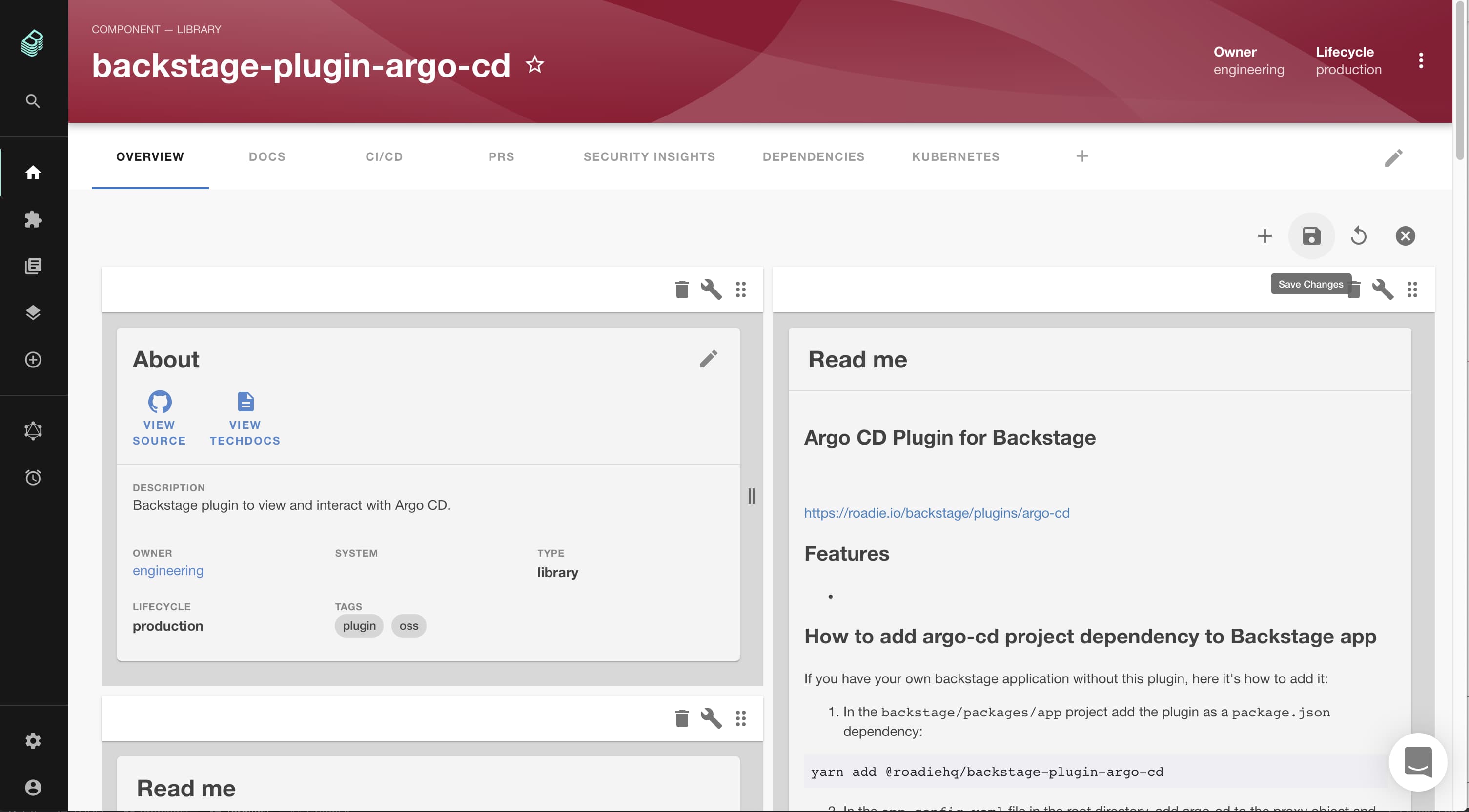
This will switch the dashboard into an edit view. You can drag and drop to rearrange or click the dustbin icon to remove a card.
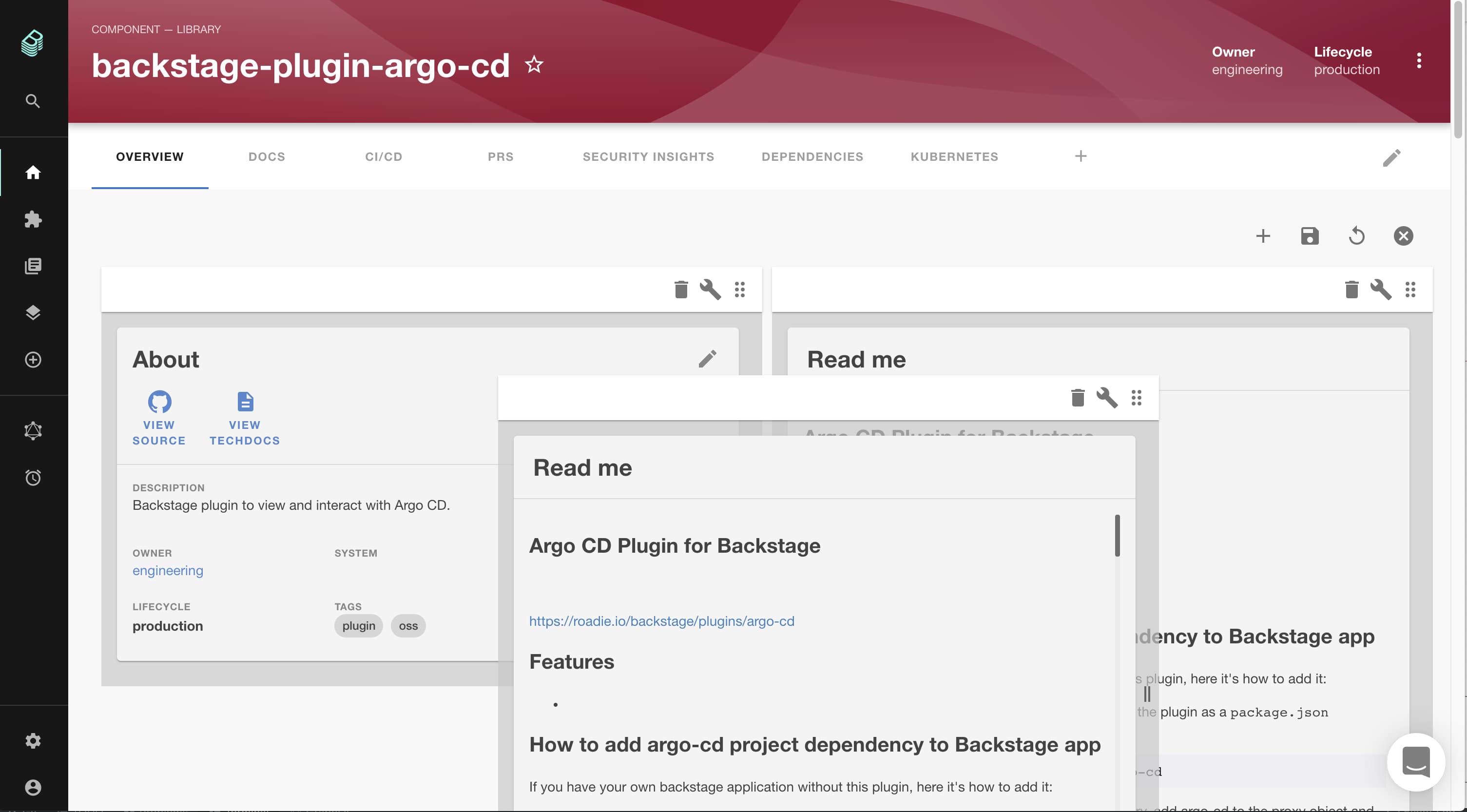
To add a card click the plus icon in the menu on the top right of the dashboard.
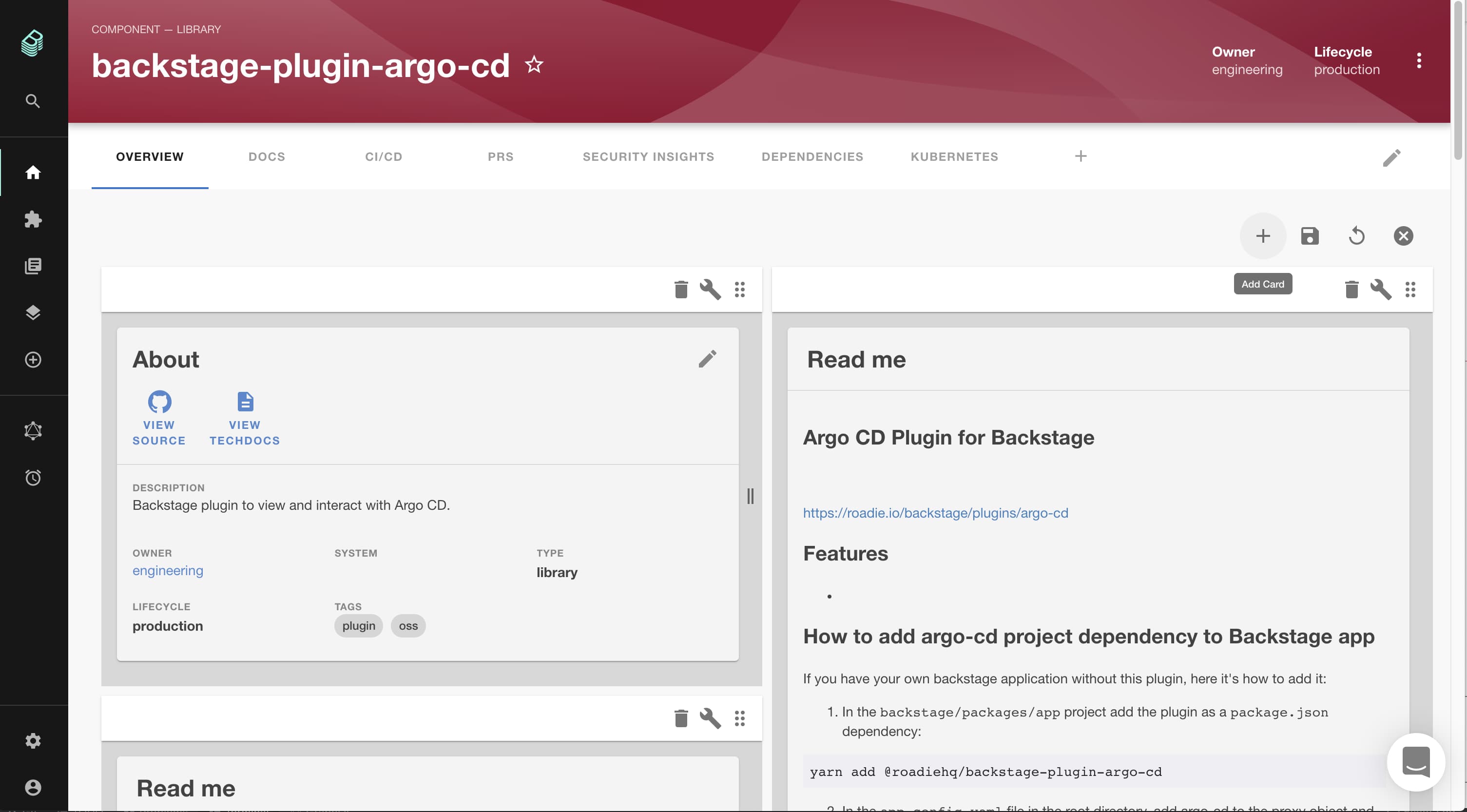
Then select the card to add and click "Add".
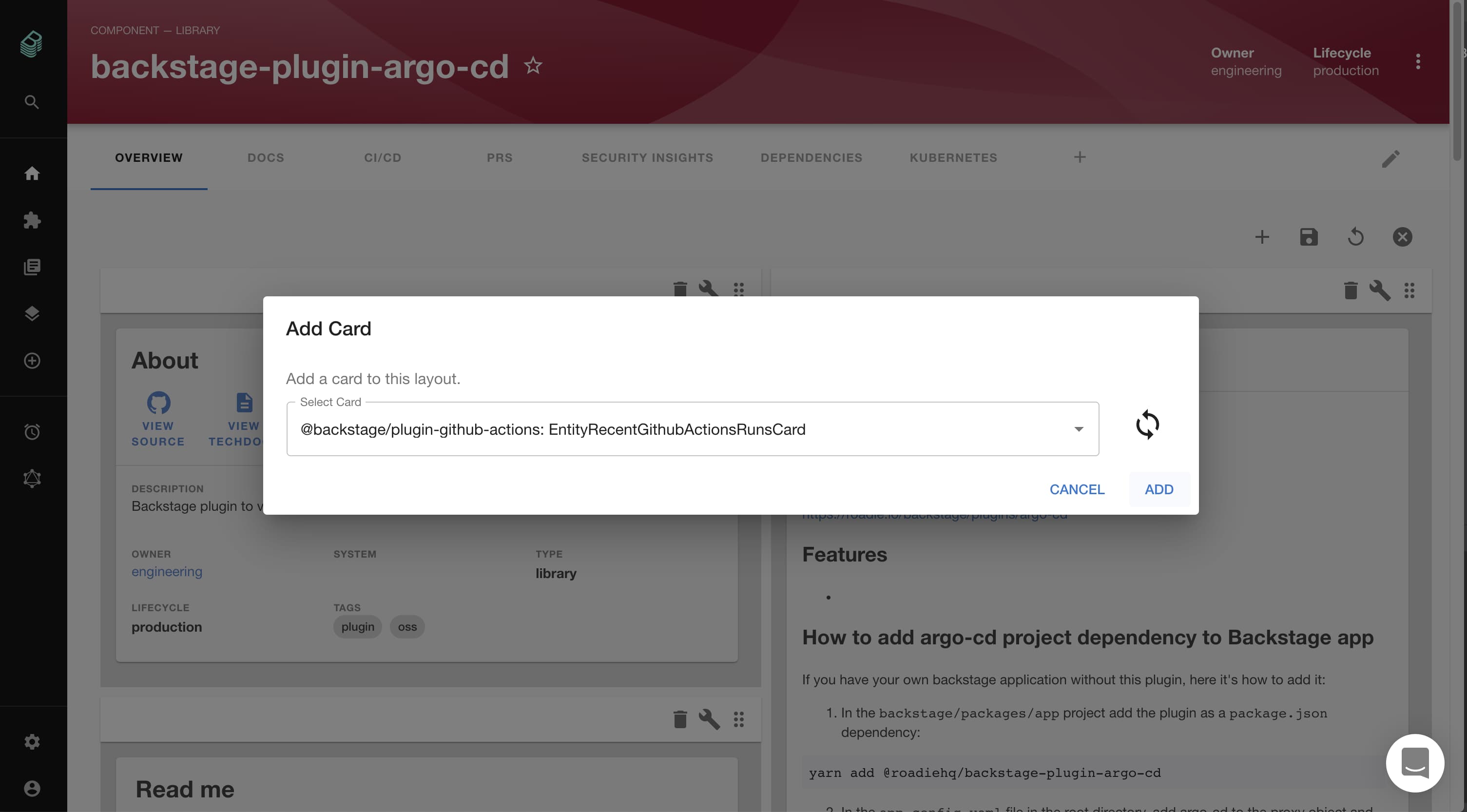
You can adjust the position of the new card as above. When you're finished don't forget to save your changes!
Entities will have one "Overview" dashboard by default but you can add others. Simply create a tab selecting "Dashboard" as the component to add.
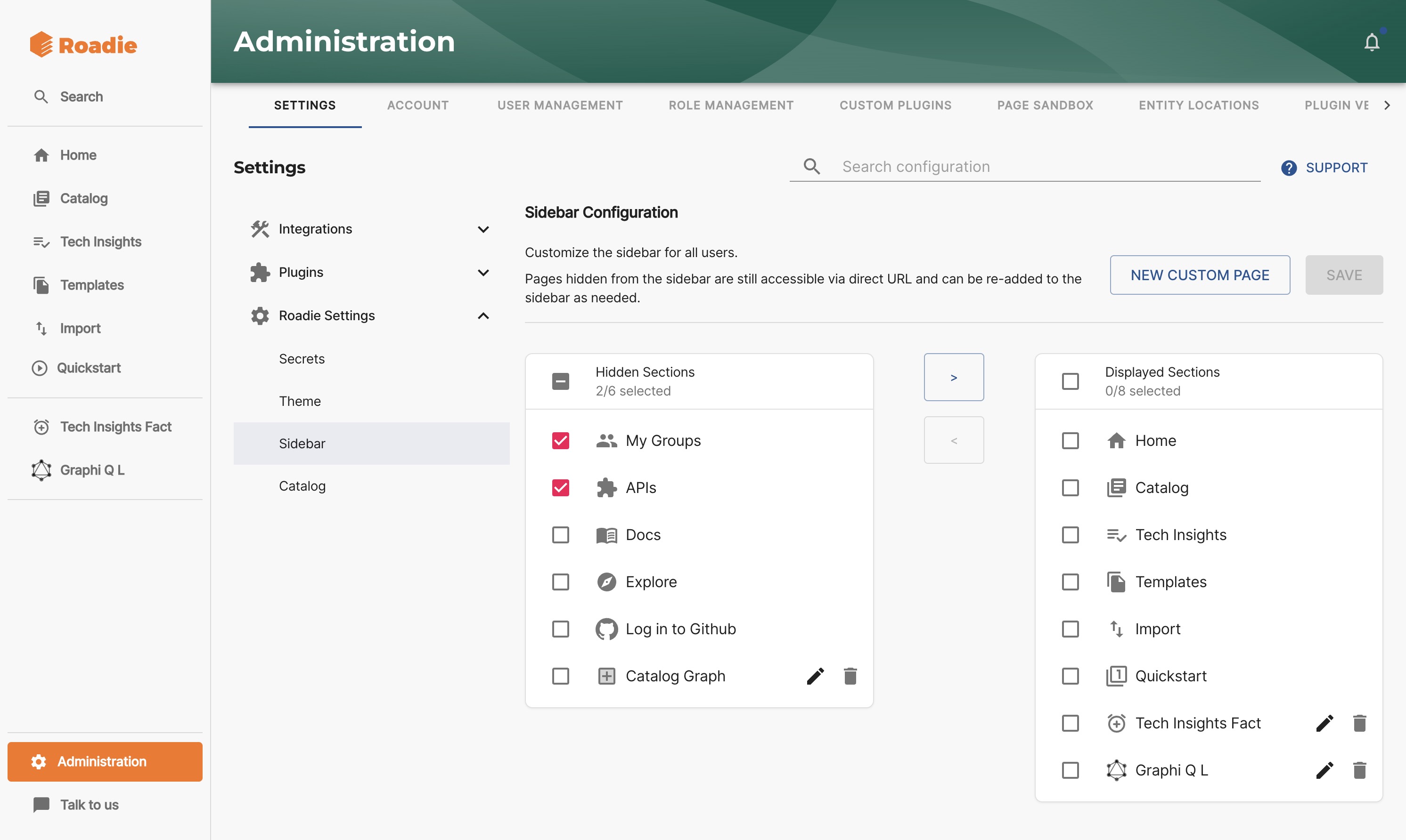
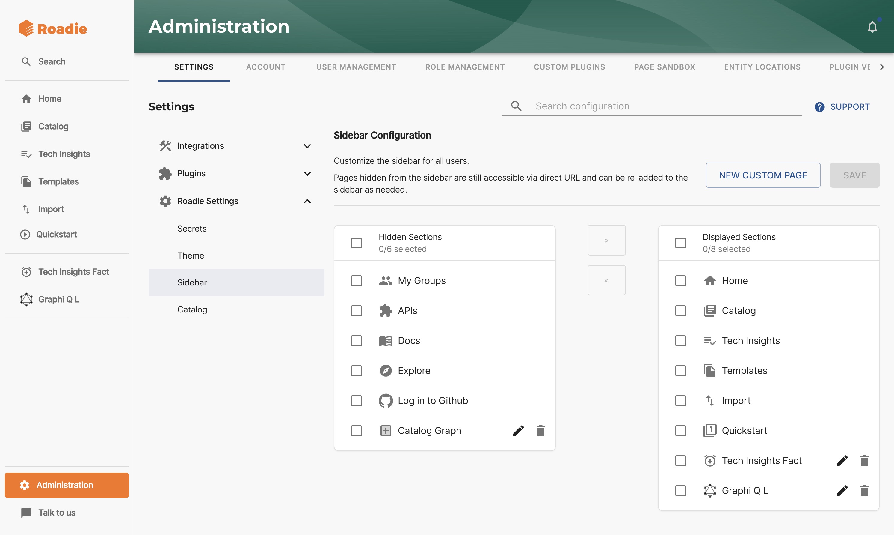
Updating the Sidebar
Sidebar section of Roadie allows you to add Page components as entries to it. To edit the sidebar navigate to the Administration -> Settings -> Roadie Settings -> Sidebar.
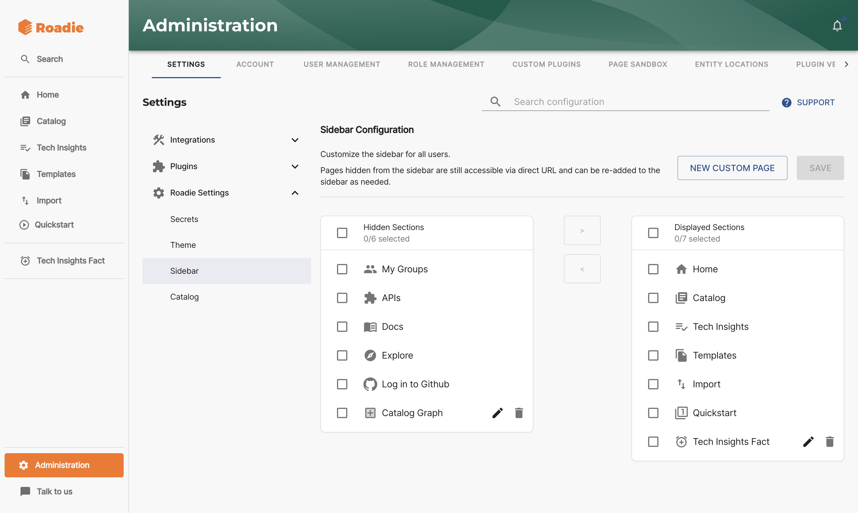
You can then choose to display or hide any pages. You can also edit and delete Custom pages using the "🗑" and "✎" icons.
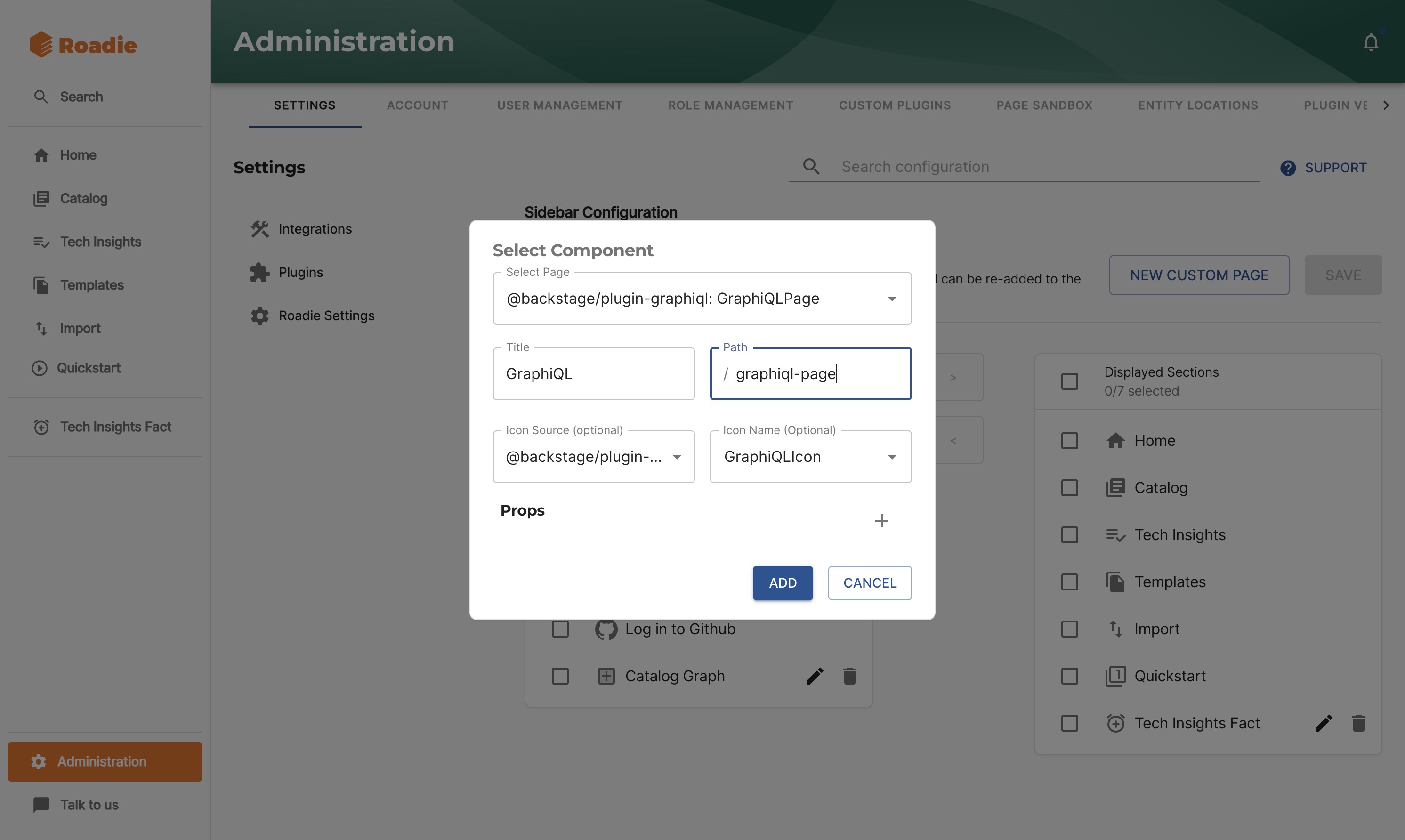
To add a new Custom page, click the "New Custom page" button.
Select a component in the autocomplete. Adjust the title and path as necessary and click "Add". You can optionally choose a custom icon for the new page.
Your new page will appear as part of the visible items, both in the Sidebar Settings page and the Sidebar
Sidebar Links
You can create sidebar entries to other pages in Roadie for quick access or to embedded external websites using the iFrame plugin.
Links to embedded external sites can be added using @roadiehq/backstage-plugin-iframe: IFramePage.
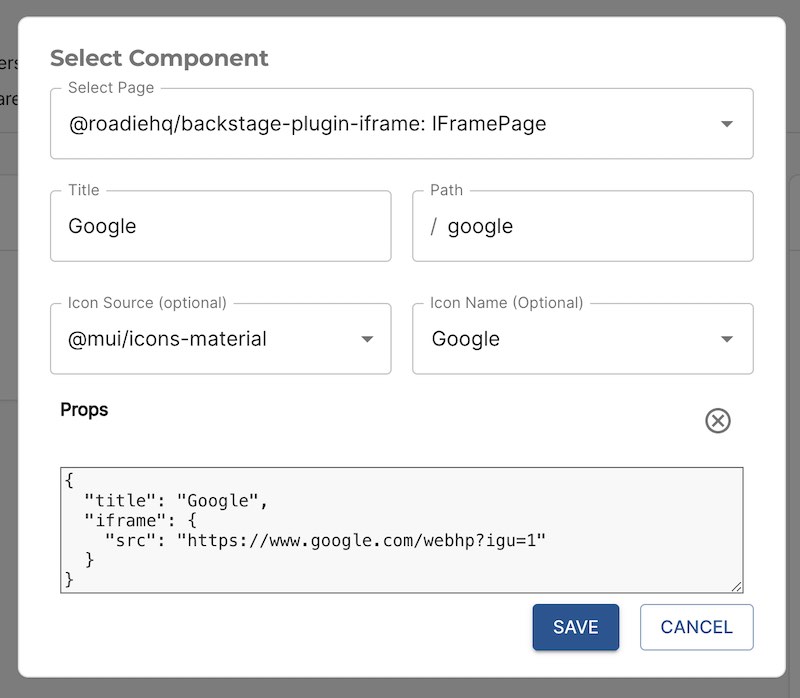
Custom props are required specifying the iFrame compatible site like so:
{
  "title": "Google",
  "iframe": {
    "src": "https://www.google.com/webhp?igu=1"
  }
}
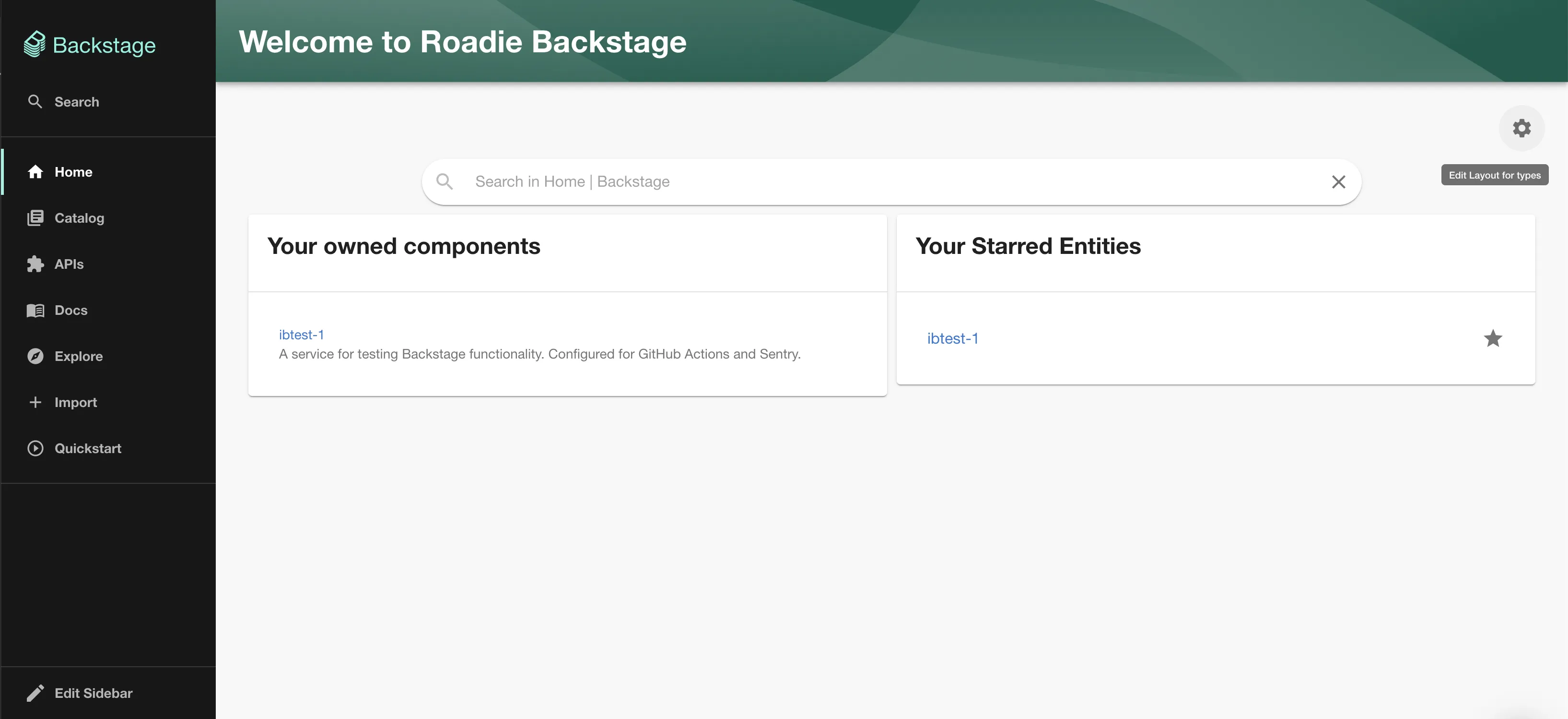
Updating the home page
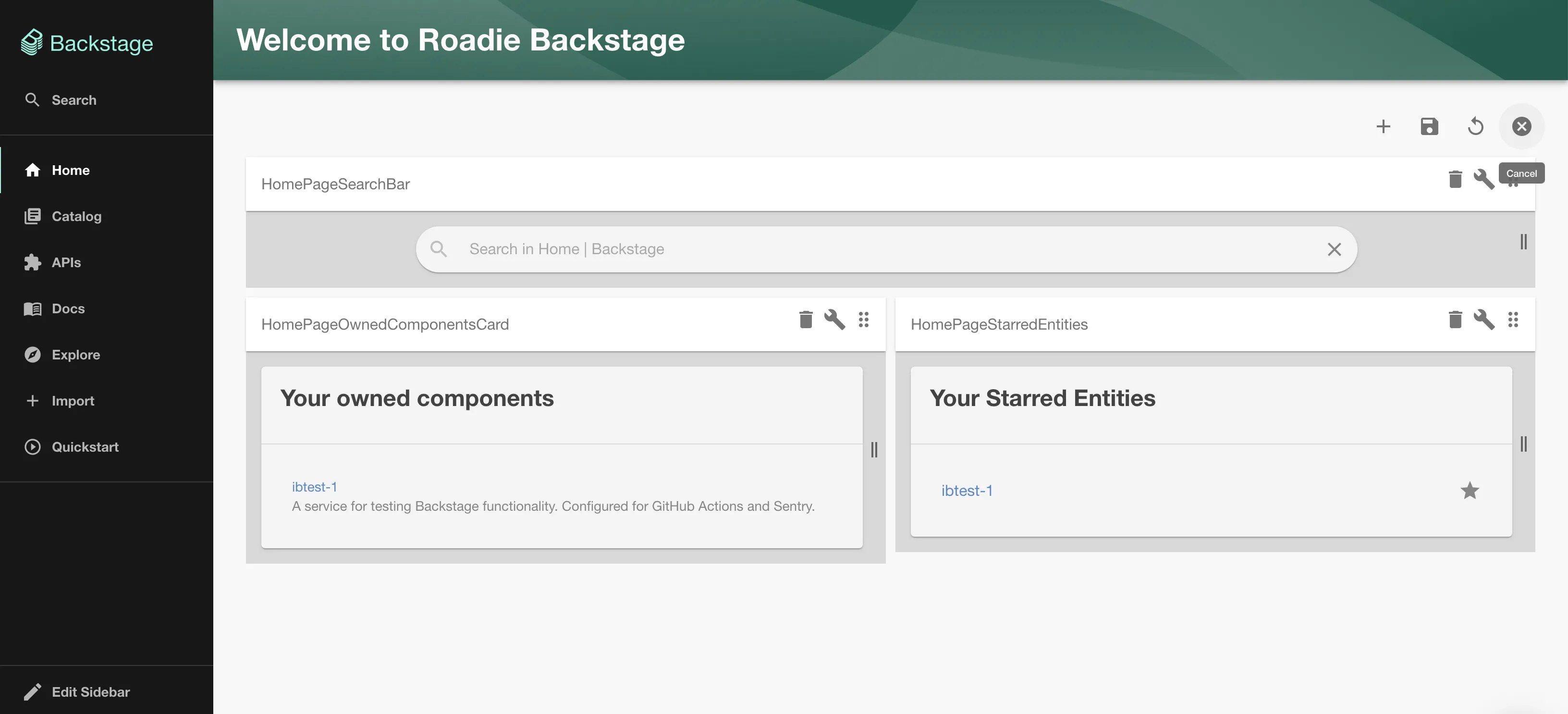
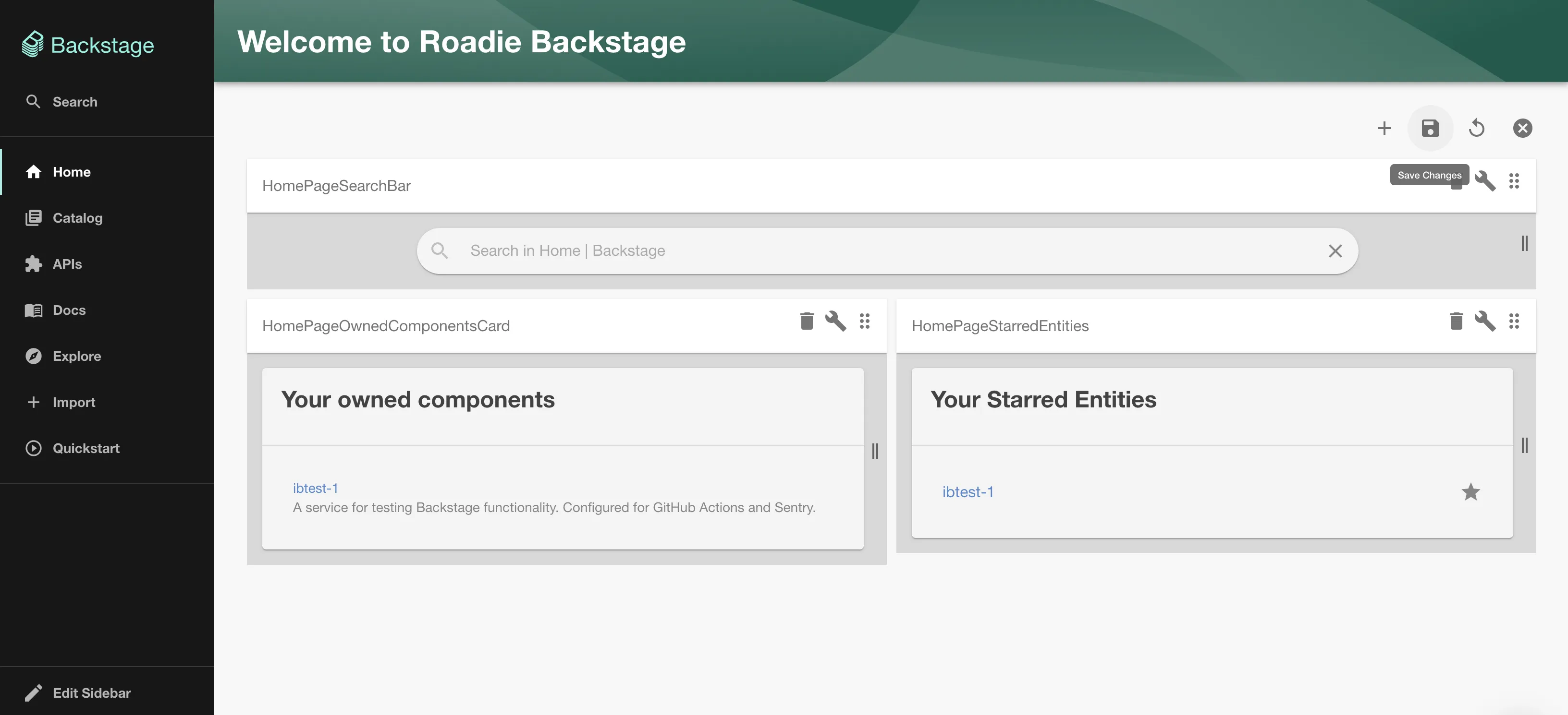
To edit the home page click the cog icon on the top right of the dashboard below the header.
This will switch the home page into an edit view. You can drag and drop to rearrange or resize, click the dust-bin icon to remove a card then click the save icon.
To add a card click the plus icon in the menu on the top right.
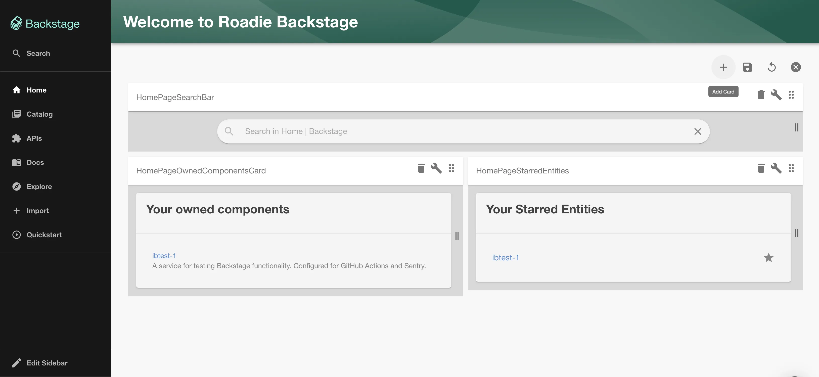
Then select the card to add and click "Add".
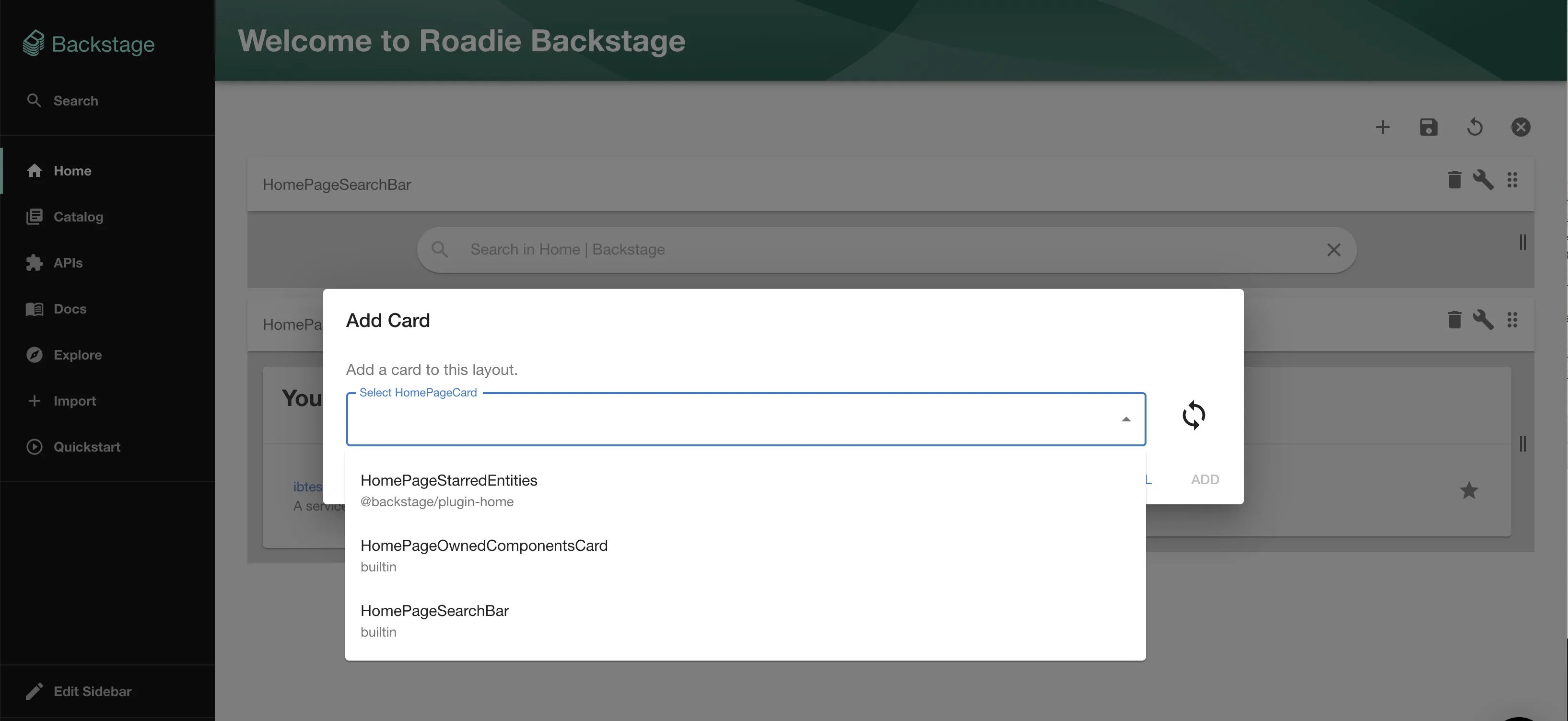
You can adjust the position of the new card as above. When you're finished don't forget to save your changes!
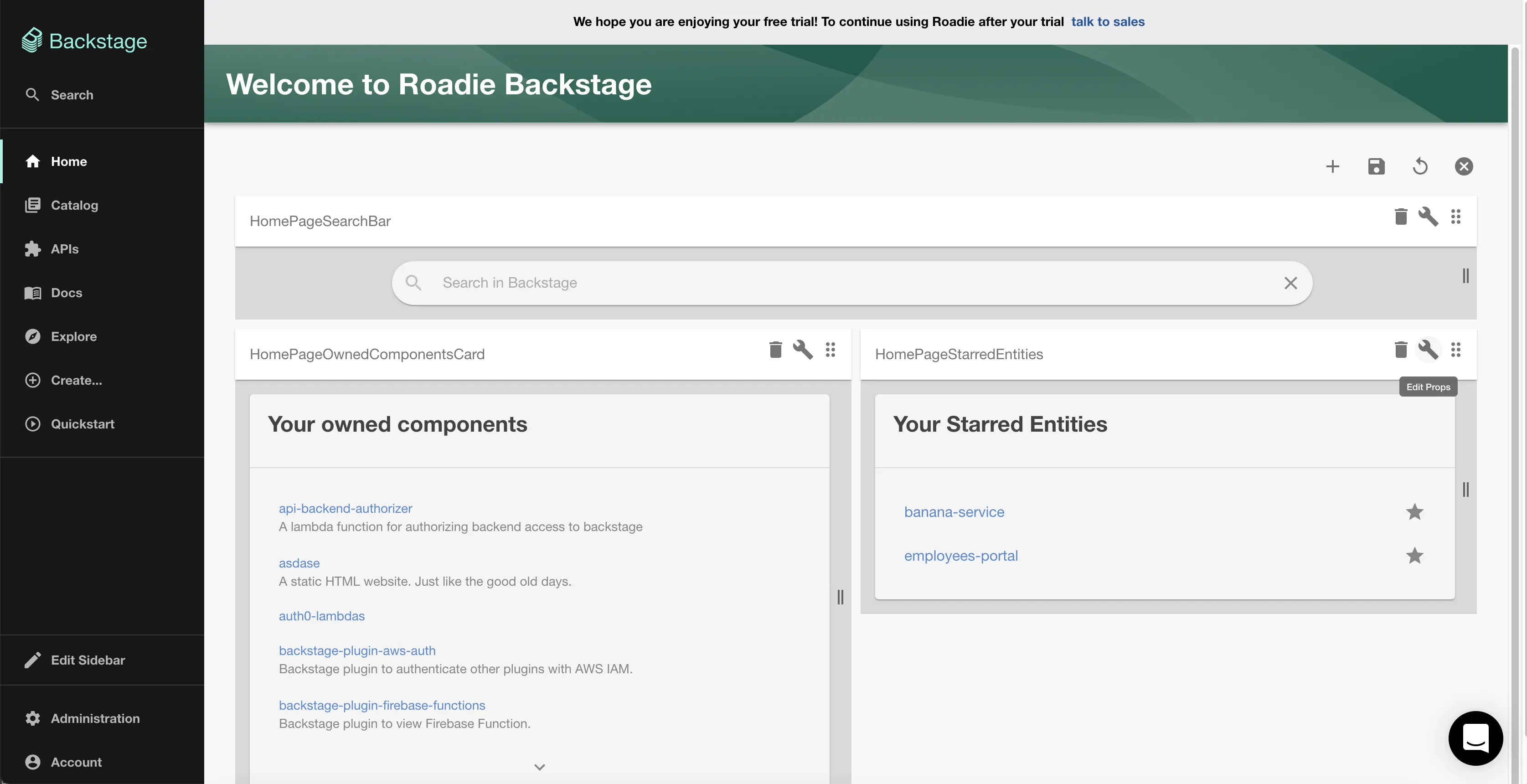
Adding props
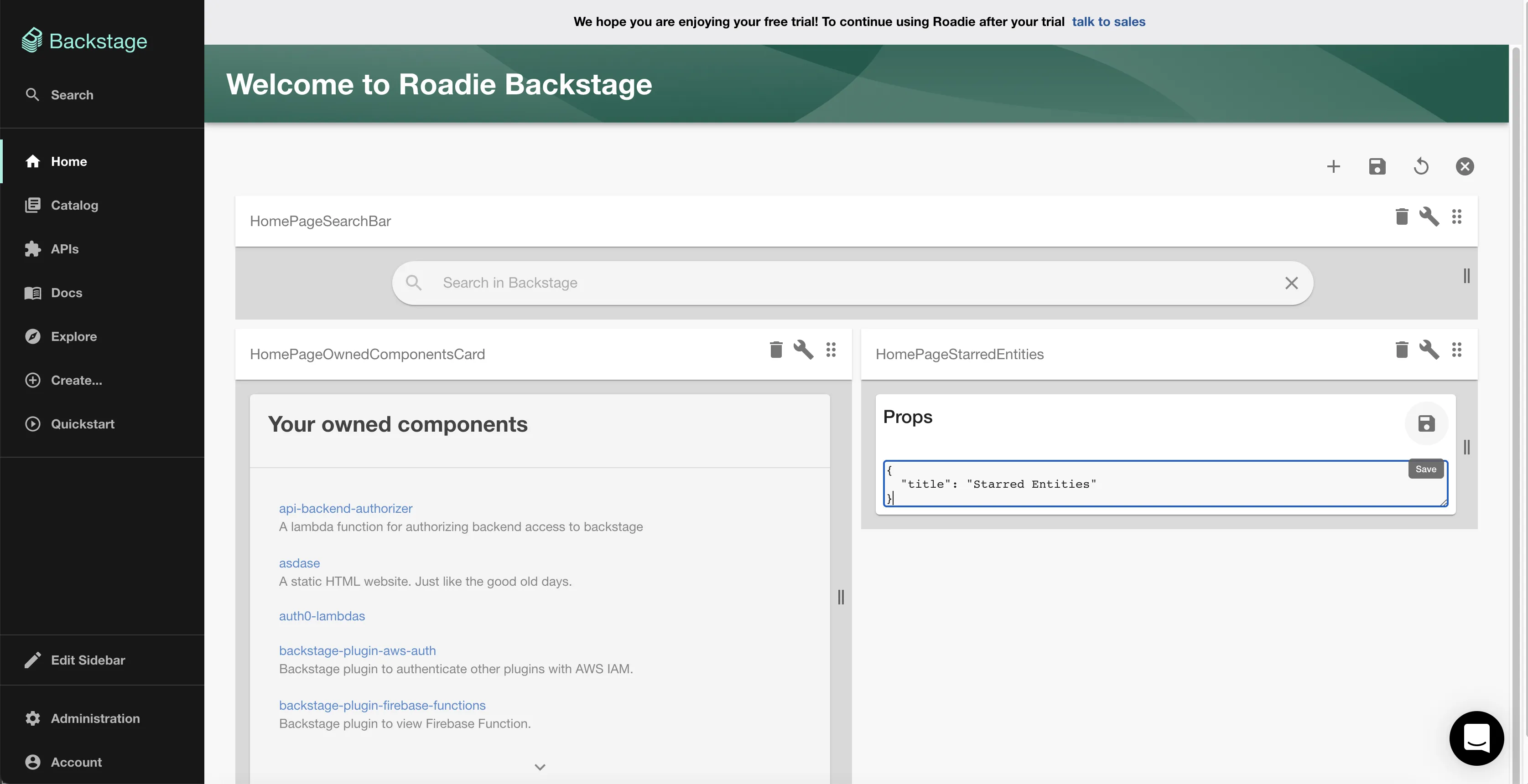
It is possible to add props to cards on the homepage and catalog dashboards. To do this, enter edit mode by clicking the cog icon and click the spanner icon for your desired card.
Currently, it is necessary to provide props as JSON. Once you have entered your props click the save icon in the card then again in the dashboard menu to save the layout.